

You must log in or register to comment.
Seems like a major server not reporting their numbers.
Possibly an outage from a patch no?
That makes a lot of sense.
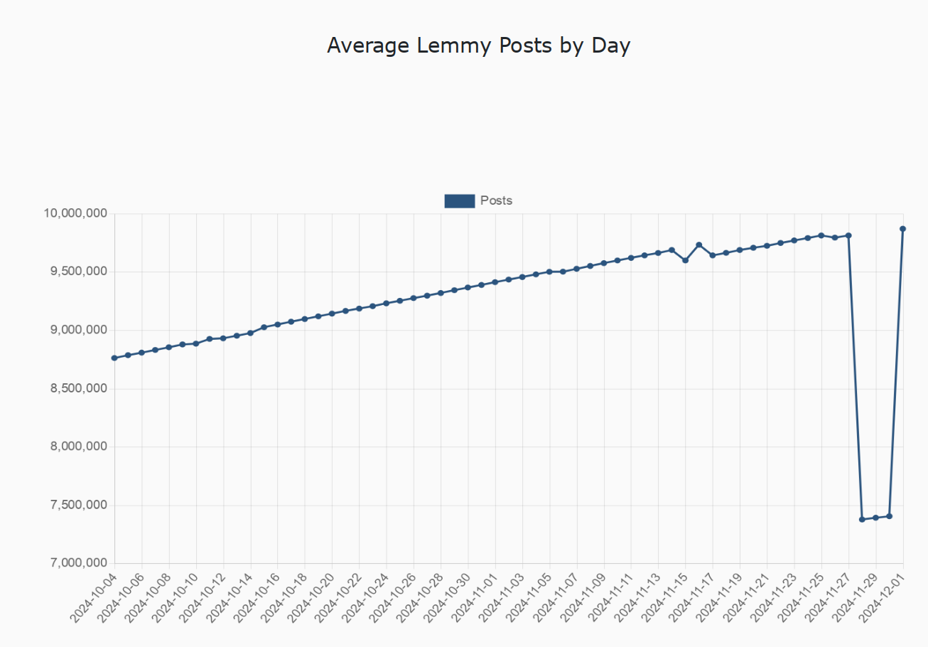
I hate the fact that the vertical axis starts at 7 million, making the drop seem deceptively large
Seems fine to me, the axes are easy to understand and there would be a lot of unnecessary whitespace otherwise. Though, it does require some reading comprehension, and that one actually looks at it and not just skims over.
This reading comprehension joke it overused and it doesn’t even make sense here. It’s well-known that you need at least one of those little zigzag indicators when the graph doesn’t start at 0 in most cases to avoid people misinterpreting the graph and to make it much more visually clear.
Using compressed axes to display data was literally “How to identify misleading statistics 101” in middle school for us…
It seems fine to you but for the majority of people it’s misleading most people look at the lines and the relative distance between them to make judgment calls. Not literally the entire point of graphs, to visually display information.
This is a well-known effect and is taught in pretty much every major curriculum.
And the above was literally how I was thought to represent data in university. Maximize the areas of interest, make sure to properly label your axes (lest they become misleading), and remember to trim empty space where relevant.
But it appears that proper graphs for science and engineering reports may not be used for representing data to the common man, as it must be assumed that, even for the most simple of graphs, the common man will only look at the funny line, but not the graph itself.
Yep. You essentially summed up my point.
There’s a difference between data display for academia and data display for the general public.
The general public is generally not well educated on understanding the data that’s presented to them. Big change in line up or down regardless of scale means big change. It could be from 100 to 100.8, but if the scale is zoomed in then that could be presented as a +80% change.
And often is and sometimes with the axes removed and shown on the news specifically to be manipulative.
I really don’t understand why I’m being downvoted above… This was literally part of my grade school education on identifying and avoiding misinformation. And later on, around how the general public understands data visualizations. They are largely understood at a glance and taken at face value without reading the axes.
This is a easy way to push misinformation. Not by actually pushing real misinformation but by taking advantage of the general public’s tendency to not read it carefully.
Which is manipulative. Which is why it’s taught in some places as part of the standard educational curriculum…
We need to post harder, not smarter
This should say total posts, not average, right?
I am thinking it is probably comments and not posts as well.
What would cause this?
Assuming it’s not a bug, maybe Americans busy with Thanksgiving? I know I was on less as a result
I’m thinking that, a lot of users were hanging out with relatives and traveling.
Yeah, I barely looked at Lemmy Thursday - Saturday.
Turkey day travel and spending time with family by prolific posters is likely.
som kind of bot going down maybe?
People preparing xmas gifts and planning for holidays?
That looks much more like a data artifact than an accurate representation of behavior.
I think that the trajectory of the three low dots matches the overall slope very closely in a way that looks far more like a flat subtraction of all three. If it was behavioral, I think you’d see the behavior come and go over the course of several days.


