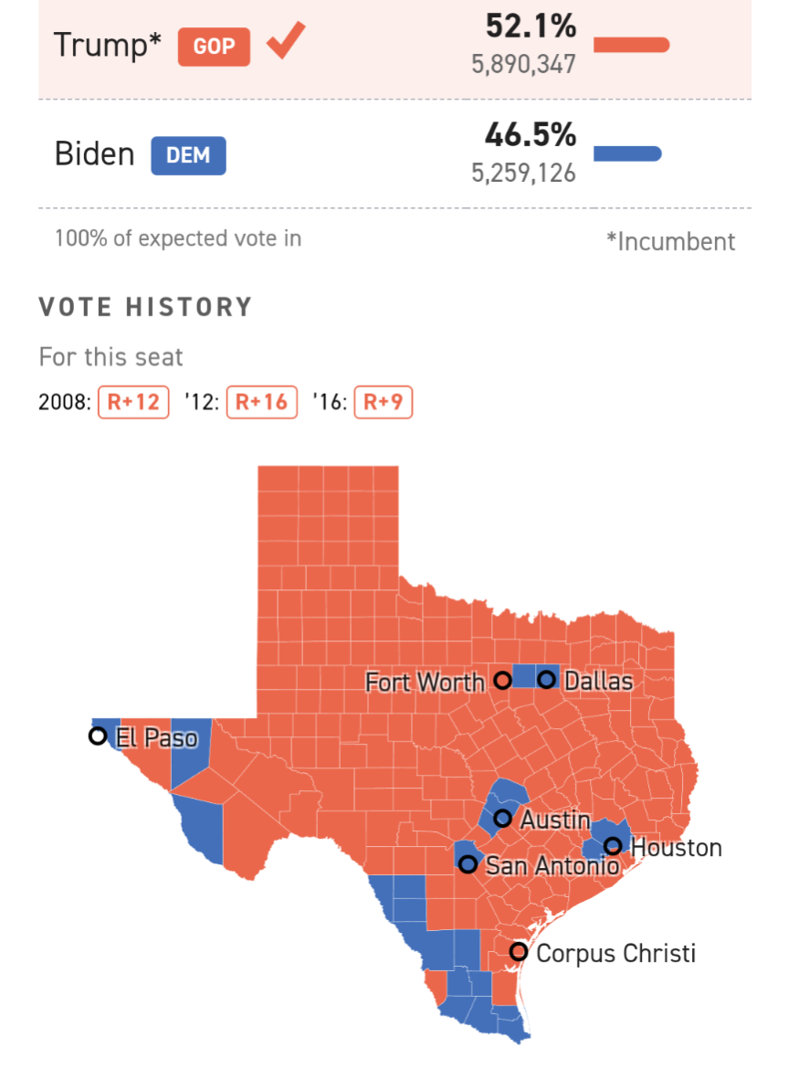
I’ve seen several people claim that their state’s vote for the US presidential election doesn’t matter because their district is gerrymandered, which does not matter for most states.
Most states use the state’s popular vote to determine who the entire state’s electoral college votes go to. No matter how gerrymandered your district is*, every individual vote matters for assigning the electoral vote. [ETA: Nearly] Every single district in a state could go red but the state goes blue for president because of the popular vote.
*Maine and Nebraska are the notable differences who allot individual electors based on the popular vote within their congressional districts and the overall popular vote. It’s possible there are other exceptions and I’m sure commenters will happily point them out.
Edit: added strikethrough to my last statement because now I have confirmed it.
Of the 50 states, all but two award all of their presidential electors to the presidential candidate who wins the popular vote in the state (Maine and Nebraska each award two of their electors to the candidate who wins a plurality of the statewide vote; the remaining electors are allocated to the winners of the plurality vote in the states’ congressional districts). (source)
YSK the electoral college can get fucked.
It creates maps like this that make people stay home because they believe their vote doesn’t count.

For me, it’s helpful to remember what the underlying reality is.

Skewed for population and colored on a red-blue scale to reflect vote mix.
When those votes are counted, the resulting electoral votes align to those votes, which results in maps like what you showed. When strategists tune their messages to target demographics they can divide (e.g., rural vs. urban), they’re playing a game of inches and shades on this map of purple goo, and that’s still the reality behind the ultimate electoral vote, even if it doesn’t feel like it.
Keep voting, everyone!
edits: So much autocorrect.
Hey, that’s a neat image. I’ve seen other ways of visualizing the popular vote on a map but this one looks wonky as hell and I like it.
Data can be beautiful. I just found a similar but maybe clearer example from 2016 with a nice write-up about it.
Teaser from that article:

I think the common term for these is “cartogram”.


