• 0 Posts
  • 7 Comments
Joined 1 year ago
cake
Cake day: July 10th, 2023

help-circle

  • ltxrtquq@lemmy.mltoWorld News@lemmy.worldBiden calls for 'immediate ceasefire' in Gaza
    link
    fedilink
    English
    arrow-up
    6
    arrow-down
    1
    ·
    edit-2
    8 months ago

    The numbers for 2023 are no higher than normal either

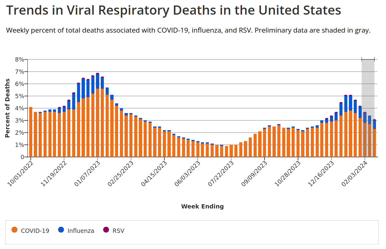
    The numbers for 2023 in the 2-3 months you have data for. Look at the rest of the graph, how it starts off lower in January and is higher for the rest of the year. Go back up and look at this graph

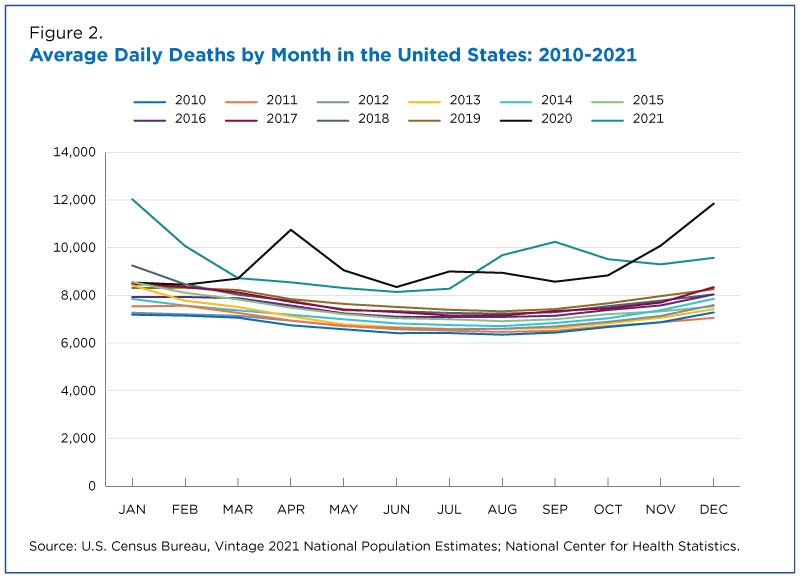
    and see how covid comes in waves each year, not evenly distributed throughout. Then go back and look at this graph

    and see that based on the data we have in the US, deaths per year has stayed above the previous yearly patterns. We don’t have all the data over a long period of time because covid hasn’t been around for all that long. But from what we can see so far, it kills people. The exact number per year remains to be seen, but from the data we have it’s been in the thousands, just in Norway.

    Edit: I guess next time I see a fucking “mOVInG tHe GOOalPoSt!!!” I will take the clue and not fucking bother.

    Half of the sources you posted actively worked against your own arguments. Maybe you shouldn’t bother.

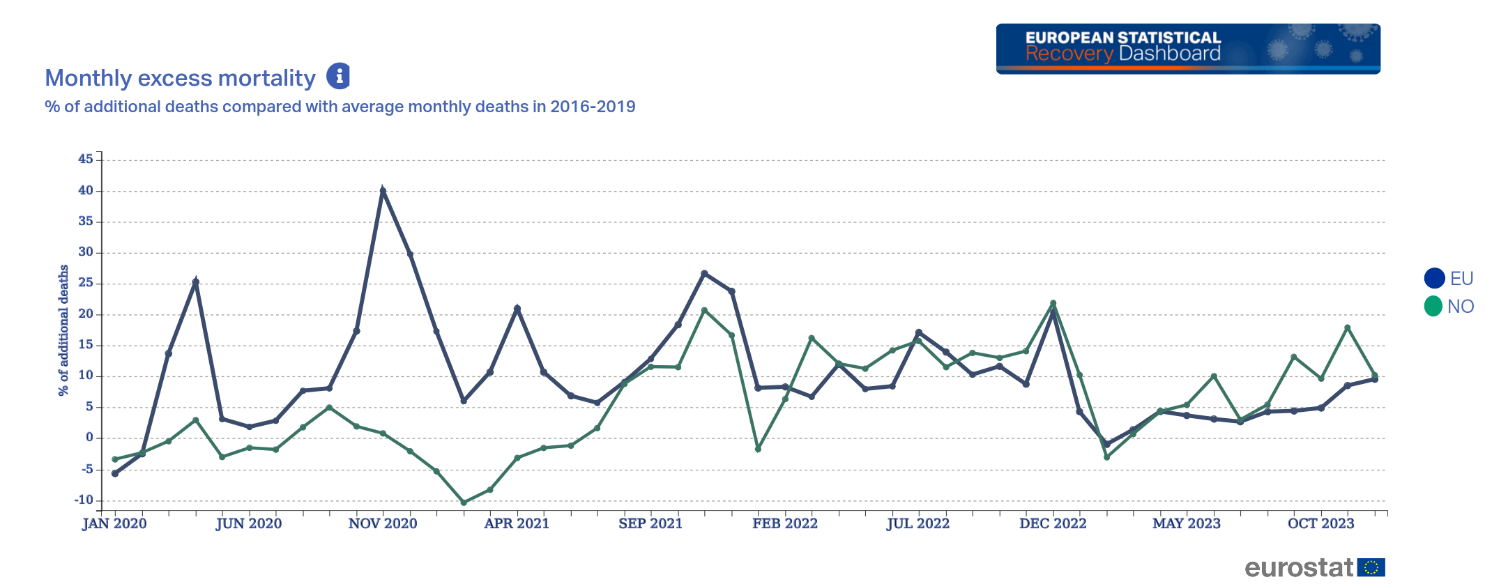
    EDIT of my own: After looking at one of your sources (Eurostat)

    you can see that January-March was lower than 2016-2019, but it’s been on the rise again across the EU, and especially in Norway. Again, you can’t just look at one single month and decide that it’s representative of everything, everywhere, across all time going forward.


  • From that we can conclude that after an initial burst in death numbers, as covid and other viruses passes through the populace, death rates return to normal.

    I mean, no, we really can’t. There’s not enough data available (that I’m willing to search for) to say for absolutely sure that excess deaths has increased and will stay high, but even just the snapshot you provided here shows that it’s slightly lower in January, and massively higher the rest of the year. Maybe the May 2023 data shows that the numbers are evening out compared to 2016-2019, but the one year we actually get to see shows way more excess deaths over the course of a year compared to before. You can’t just look at the most recent month, that’s not how yearly trends and averages work.

    You won’t have much of an argument that the numbers are going back to “normal” until you’ve got closer to a full year’s worth of data with that excess deaths line being close to zero.


  • So if I’m understanding you correctly, you went from

    you still have to account for the fact that covid might kill an old person that would otherwise die to influenza in a month or two

    thinking covid wasn’t causing any/many additional deaths per year, just speeding them up a little

    to providing a graph that shows thousands of extra people are dying each year

    The increase of 2022 and 2021 was expected due to general decline of normal viruses (caused by covid measurements)

    to saying all those extra deaths were because people weren’t getting sick from normal diseases, despite us not seeing much of a drop in 2020 from people not getting those diseases during the covid restrictions. But now that the restrictions are lifted and they’re being exposed to those normal diseases (and covid) again, all/most of theses extra deaths are from the normal diseases and have nothing to do with covid.

    Norway absolutely did a better job at handling covid than the US, but the US’s death rate seems to just be permanently higher now as a direct result of covid. Maybe removing all restrictions was the right thing to do, but we shouldn’t ignore the fact that it comes at the cost of several thousand more people dying each year, just in Norway.


  • It looks like you’re getting the data from here (except the Norwegian language version), so I have to ask: is there a reason you’re cutting off the part of the graph showing “Deaths per 1000 mean population” spiking in 2022?

    This new table is from here, and you can click “Choose variables” at the top if you want to see different data. But even just the graph you provided shows that total deaths for both sexes jumped up dramatically in 2022, the year you say covid restrictions were lifted. What are you trying to prove here exactly?


  • Even if I ignore you moving the goalposts, would you really look at a graph like this

    that’s a few years out of date and assume the total deaths settled back down into the old pattern?

    I’m not finding a more up-to-date data source for deaths per month, but it’s not like you’re providing any kind of data that covid isn’t still killing a lot of extra people per year.