dual_sport_dork 🐧🗡️

Progenitor of the Weird Knife Wednesday feature column. Is “column” the right word? Anyway, apparently I also coined the Very Specific Object nomenclature now sporadically used in the 3D printing community. Yeah, that was me. This must be how Cory Doctorow feels all the time these days.

  • 1 Post
  • 286 Comments
Joined 2 years ago
cake
Cake day: July 20th, 2023

help-circle
  • Oh yeah? So I guess that’s why Jews take off their yarmulkes when they go indoors or are in prayer, right? Oh, they don’t? That’s strange…

    Whole huge wide swathes of what people insist passes for modern Christianity are basically what amounts to fan fiction. Dumber people will fight you tooth and nail insisting that various culturally ingrained tropes and details really are in the book when in fact they’re not, but you’ll find that the religious apologists with a little more brainpower at their disposal have instead invented an array of tricks and deflections to downplay or just outright dismiss these discrepancies.

    A few of my favorites:

    The big one, of course, is that pretty much the entire modern interpretation of hell, including what it looks like and how it works, is taken entirely from the Divine Comedy. Particularly Dante’s Inferno, and to a lesser extent John Milton’s Paradise Lost. The bible itself is actually curiously silent on the location, mechanics, accessibility, and even temperature of hell. The Book of Revelation does make a reference to the “lake of fire” multiple times but it’s not actually outright stated that this is hell itself, merely where the devil, the beast, and the false prophet will be cast after their final judgement.

    While we’re at it, it’s the Book of Revelation, not the book of “Revelations,” plural, no matter how many times you’ve watched the Matrix trilogy.

    How many wise men visited Jesus in the manger? Wrong! The bible never actually specifies, not even once. Three gifts are mentioned, but the number of magi bearing them is never referenced. The only thing we know is that they were plural, so it must have been at minimum two. It’s only assumed that there were three, one per gift. Further, the now traditional names of Melchior, Gaspar, and Balthazar are extrabiblical fabrications that stem from the Excerpta Latina Barbari which was an 8th century Latin translation of a Greek compilation from some 200 years earlier, but still well after the heyday of Big J himself, not to mention anyone who could have been a living eyewitness. At least they managed to make some cameos in Chrono Trigger, though, so we got something out of the whole debacle.

    Also, only the gospel of Matthew mentions the magi at all.

    Infamously, in 1 Kings 7:23-26 as well as a reiteration in 2 Chronicles 4:2-5, the bible describes in some detail a presumably circular cauldron which, if we believe the dimensions as stated, would force pi to be equal to three. No mention is made as to the involvement of Bergholt Stuttley Johnson in all of this, but in light of that maybe we can’t rule it out. Either way, the notion that pi is in fact not equal to three is obviously thus an extrabiblical interpolation in and of itself, never mind the fact that it’s part of the math that makes the modern world work and, among other things, keeps satellites from falling out of the sky.

    The notion that “Lucifer” is one of the names of the devil is also a modern-ish misunderstanding, and the story that “everyone knows” (possibly courtesy of the Spawn comics, or Jay and Silent Bob) about the devil being a rebellious angel who was cast out of heaven by god and cratered so hard he landed in hell is not really supported by the bible and is probably a myth absorbed from other nearby cultures. The name is only mentioned once in the entire bible, in Isaiah 14. It’s never actually said that whoever Lucifer may be was actually an angel, and in fact it’s understood that he is actually supposed to be the mortal king of Babylon at the time. Nor anything about how he might have became the devil after falling from heaven. Ezekiel 28 is also trotted out as allegedly being the other half of the Lucifer/casting out of Satan story, but the object of god’s ire here is the King of Tyre, also a mortal as explicitly mentioned by god twice. Halfway through god starts calling the dude a cherub and claiming he was present in the Garden of Eden, so suddenly mid sentence he’s talking about somebody else? This is god, right, an entity to famously direct he blows up entire cities because a couple of their residents piss him off? And on that note, god clearly burns whoever he’s talking about to a crisp and kills him very dead by the end of the passage so that doesn’t make any sense either, even if all the purple prose about cherubs and Eden and blamelessness and so forth weren’t just mockery for getting ideas above his station (which seems a bit more plausible). So even if said entity were the devil he’s not ruling in hell; god killed him.

    Revelation is no help there, either. The devil is just there already by then, with no details given on where he came from.

    We could go on like this forever.


  • Those warranties are parts only, not labor, and only on some specific component of the machine. It’s never a full 20 year parts and labor warranty, and certainly not a replacement warranty.

    Samsung, LG, and even Maytag (Whirlpool) do this in the US also. They have their big “10 Year Warranty!” labels on the fronts of their machines, but if you peer at it with a magnifying glass it will reveal that it says parts only on the motor right below it.

    Obviously this is basically worthless unless you have the wherewithal to replace that motor (or compressor!) yourself. But it lets them legally slap a big 10 on it, in the hopes the consumer will get a warm and fuzzy feeling on it and not notice the provisos until it’s too late.



  • I said it in the last thread and I’ll say it again here: I do not give a single flying fuck about any political motivation behind the changing nor changing back of the Cracker Barrel logo, either real or simply perceived, but their new logo was objectively terrible. It was so bland and unmemorable that whoever designed it should have their Macbook confiscated and be catapulted into the ocean. That is, the both of them. But preferably one each into different oceans. I don’t know how much that braindead rebrand cost them in consultancy fees but I hope they can ask for a refund.


  • This would become quite a thorny constitutional issue very quickly. The 14th amendment explicitly specifies that one state can’t try to prosecute someone for something done in another state that was legal there but is illegal here. This has further been interpreted to mean that interstate travel as a whole is a protected right, and any form of checkpoint or other hassle-station on a border between states would surely also be a 4th amendment violation.

    That’s not to say some idiot won’t try it eventually, especially given the current political climate, but up until now it’s not done as a matter of course.

    A state neighboring mine got in big time hot water a decade or so ago for stationing their own cops in our state and tailing people out of liquor store parking lots with the aim of harassing them over the minutiae of the differences in liquor laws between the two. Obviously that didn’t fly, because that state does not have jurisdiction here which means they have no grounds for a stop or search. Likewise, entering another state is not legal grounds for a stop and search unless that state’s law enforcement already has some manner of articulable probable cause.


  • I’d doubt that’s it. Practically everything is digitally printed these days, so the complexity really doesn’t matter. In some specific processes the number of colors used may be a factor, but the original design was already only two colors to begin with (or three if you count the transparent bits). The shape would matter if they were trying to make illuminated signage with the same outline as the logo which Cracker Barrel already don’t do. Their pole signs at present are just rectangular with rounded corners to begin with. I’ll grant there may be a minor complexity advantage to having machine embroidery done of it, but the last time I was in one of their restaurants their employees all had logo and name tag pins and their uniform shirts were sans logos, so that’s a moot point anyhow.

    I’ll certainly concede that some C-suite idiot may think this is going to save them on uniform and printing costs but in reality it actually won’t. If that’s why they really did it they’re even dumber than we’re giving them credit for. (And another commenter below pointed out that rebrands cost money to pull off. Not just whatever seven figure consultancy fee you just paid to some twerp with a Macbook to render your logo unreadable, but also all the materials and signage you then have to get made, printed, have somebody install.)

    Herewith I will prattle on about the topic because Design Is My Passion (well, okay, at least part of my job) and this whole trend obviously honks me off and I’m starting to feel like the only sane man left standing.

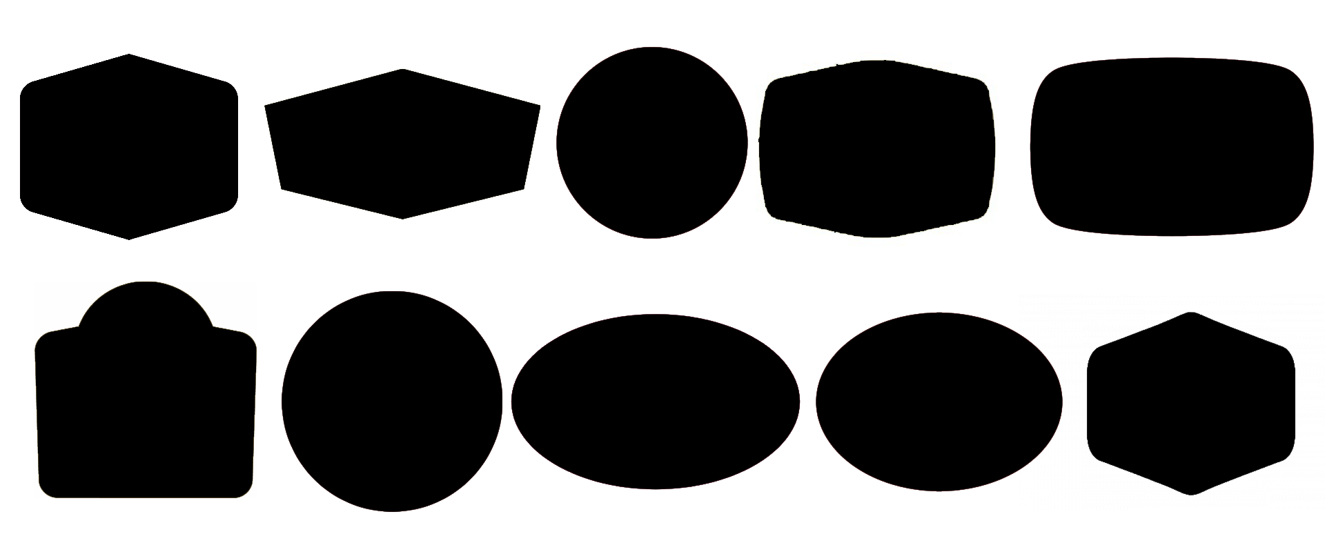
    The rationale for dumbshit logo oversimplification I usually see bandied about is “increasing brand recognition,” with the notion that a simpler logo is more readily and quickly recognizable. This has a kernel of truth to it, however only those with the pointiest of spectacles with the beadiest of chains know the secret. And that is mostly what drives this is the logo’s silhouette, not the words inside it. (And to a lesser extent, its colors. But tell that to all the fast food chains who insist on using red and yellow for their branding, so that’s already on the way out.) This is especially so if the logo will be seen only briefly or at a distance, for purest sake of example and for no particular reason at all, let’s say at the top of a pole next to an interstate highway 200 yards away while hurtling past at 75+ MPH.

    People don’t read. Even so, a large portion of them probably don’t have great eyesight. If your logo is going to be a wordmark, it had better have its own very distinct silhouette, and preferably it ought to be short. The frillier and less sans-serify you make it the less likely anyone is to be to comprehend it, let alone bother to process it. If your design vision absolutely cannot accommodate that for whatever reason, its surrounding geometry had better have a recognizable silhouette. And for fuck’s sake, make sure it’s high contrast against whatever’s inside it.

    I’ll throw out some examples. Here are four brands who, apart from any other shortcomings and even after going through various rounds of logo simplification, still get it:

    I’ve brutally reduced these to only their silhouettes and in the case of any that also included wordmarks and haven’t already removed them from their official logo, I’ve also stripped them of these.

    I’ll bet you can name three out of four of those without even thinking about it, and third from the left will only slow down some people for a second or two.

    (This is also why so many traffic signs are shaped such as they are, and the important ones don’t share shapes, and also why it feels so unnervingly wrong in a Mandela effect kind of way when you visit a country whose highway authority hasn’t quite figured that out.)

    Meanwhile, here’s a lineup of a few who fail the test:

    Yes, I deliberately cherry-picked these to form a lineup of options that all suck. But in my defense, there are ever so many to choose from. Go on, whose are those? No cheating and using Google image search to try to match up the minutiae of the aspect ratios. You have to do this right off the top of your head. Remember, these are flying by on an interstate sign.

    It’s the same deal with app icons, which these days all seem to be devolving into “some circular swirly thing, possibly multicolored, that doesn’t tell you anything about what our app does.” It’s even worse now that everyone’s launchers seem to want to automatically badger any icons that still do manage to have a recognizable silhouette into solid colored circular backgrounds.


  • I oppose this logo change not for a political reason or anything of that ilk, but only because it’s yet another senseless and uninspired simplification of a brand that eliminates the distinctiveness of its silhouette and turns it into another bland and uninspired sponge cake with no flavor. Say what you like about Cracker Barrel and their food (and I’m sure many will), but at least when you saw one of their signs on a pole from the interstate you knew damn well what it was.

    Compare it now to the Denny’s logo:

    Bojangles:

    Or Golden Corral:

    Etc.

    Wow, some text in a yellow ovoid diamondy blob. How original. No iconography whatsoever. It’s barely even a wordmark. I wonder how much some asshole got paid to come up with this and how I can get in on that game.