Honestly has me upset enough that im starting to set up a super old youtube setup i once had years ago in the before times
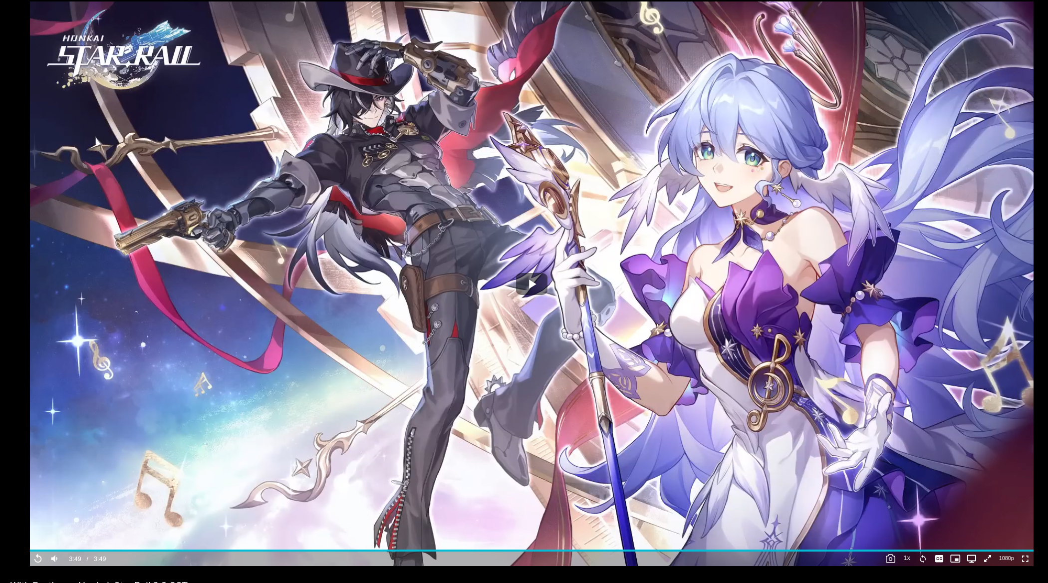
i just might rawdog youtube directly again old player also had the progress bar visible even when not focused, not anymore
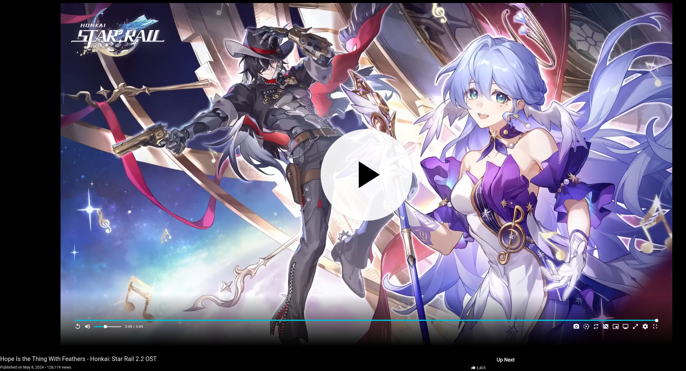
over a years worth of work and we ended up with what looks like a mobile ui


It might not actually be that bad, but I rarely like change. In my opinion, all software should have a sort of legacy UI mode.
This sounds like “I want developers’ lives to be a living hell if they ever decide to overhaul their UI.”
Fair point. Just because I have an opinion doesn’t mean people should listen to me. /srs
i asked them about a legacy option and their answer boiled down to a somewhat condescending “tough shit, get used to it”
What’s wrong with it?
Gigantic mobile like play icon
Ui not aligned with the video borders anymore
Progress bar not visible anymore unless you hover over the video
I don’t like it either. Don’t need an 18cm big button.


