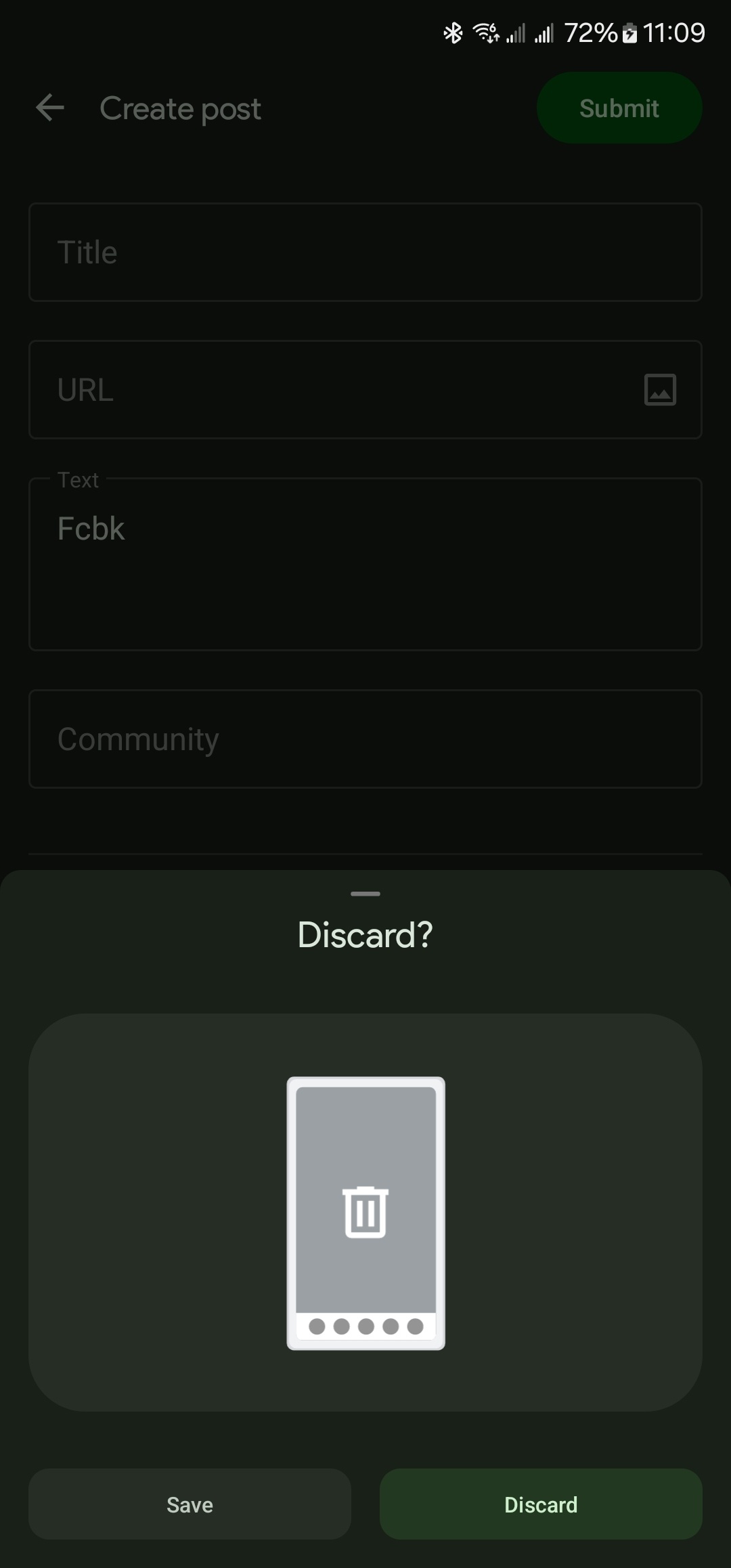
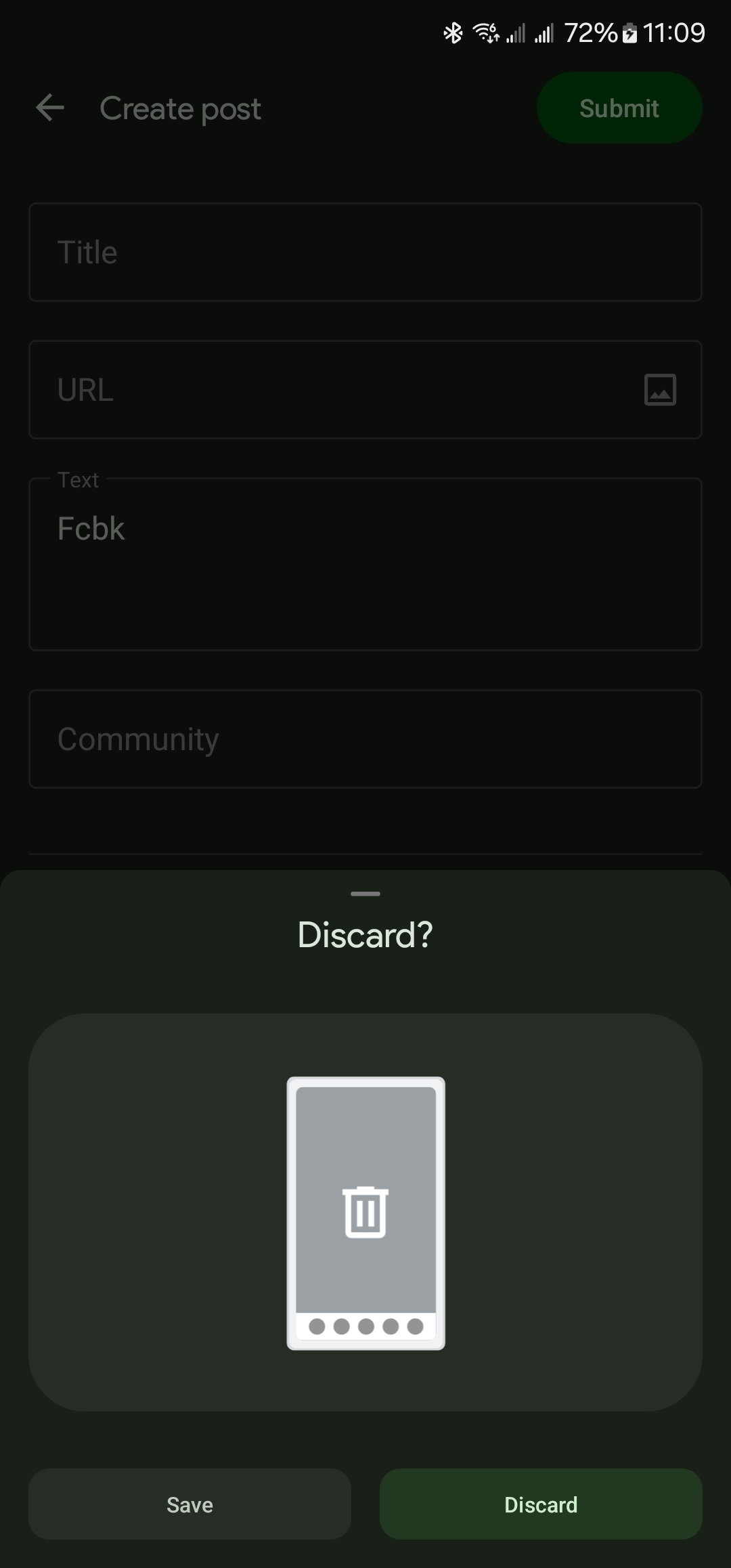
When backing out of the submit page you get this question where you have to guess which button does what.
Discard
You must choose Discard, please kindly do the needful
Petition to have an option to keep it after it’s fixed because I think it’s funny
Your task has failed successfully
Your fate has been decided by the app. You must accept the decision to Discard.
(also this is some software gore)
Actually by the colour you might tell which does which. The blue one likely confirms to discard the post and the other one cancels discarding the post.
someone commented above, it’s the opposite

It’s clearly not though? “Discard” discards the post and “Save” cancels discarding and saves it as a draft (I presume).
they both look blue to me tbh. I might be colour blind
They’re both in the blue/grey department but they’re definitely quite distinct. However you might not see the difference because of your display settings. (Try turning off any bluelight filters or change your display mode.)
Discard or datcard?
Deezcards
guess i’ll discard

Weird, it’s fine for me:

I get the same as OP

What’s your locale? I’m US English.
I think it’s different if you back out of a post with no text in it… Since your example has text in the box still, it offers to save it.
If there’s no text, I don’t get a prompt at all
Ah, I figured it out. It’s specifically the title field for some reason. Weird that there are different dialogs for the same action.
Ah, that’s right. Thanks, I had forgotten that part of the specific incantation to get that bizarre error / discard combo. 😋
Weird that there are different dialogs for the same action.
I agree.
Which language? I mean which variant of english… just in case
US
Broken


